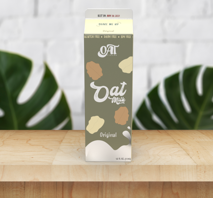
Oat Fields is an oat milk company selling the best milk to your family and friends. The warm, tan colors I chose for the logo are suppose to give off the feeling of fresh oats. The style and form of the letters 'OAT' in the logo give off the feeling of a fresh cup of oat milk. Creamy, and a little bubbly. Since oat milk tastes the best out of all other milks such as almond, I wanted to show that within my designs!
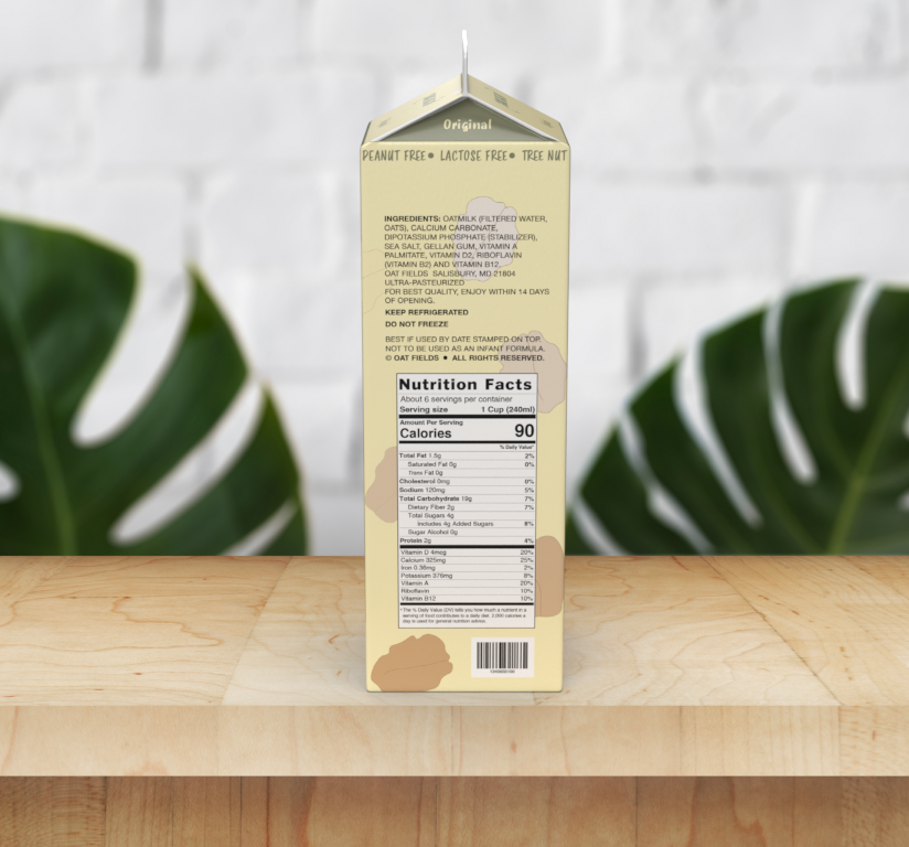
This is the carton design I created for the packaging of Oat Fields Oat Milk. At the top is where I listed what the oat milk is free from, and it repeats around all the panels. I put the flavor, 'Original', on every side of the carton for a quick and easy distinguishing for the consumer. Plus if the shelf isn't front faced, the consumer will be able to read which oat milk they are about to buy.
These are some alternate logos and icons such as social media, favicon, etc.


These typefaces are used in my logo design and packaging.
